Cadillac unveils asymmetrical 2026 F1 livery in Super Bowl ad
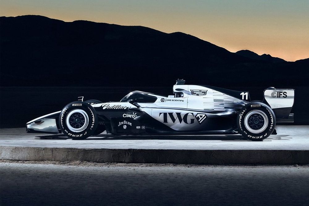
Cadillac revealed its 2026 Formula 1 car livery during a Super Bowl commercial, showcasing a striking asymmetrical design that has divided fan opinion. The livery features a predominantly black design with white accents on one side, while the other side incorporates more white on the sidepod and engine cover, creating a unique two-tone effect.
Why it matters:
As a new American entrant preparing for the 2026 regulation changes, Cadillac's visual identity is its first major statement to the global F1 audience. The livery reveal, strategically placed during one of the world's most-watched sporting events, signals the brand's serious commitment to its F1 project and aims to capture the attention of both motorsport fans and the general public.
The details:
- The design is intentionally asymmetrical, with one side of the car featuring a mostly black scheme with a white, misty fade effect at the rear of the sidepod and engine cover.
- The opposite side incorporates significantly more white on the sidepod, shark fin, and engine cover, creating a stark contrast.
- White accents are used on the wheel covers and for partner logos across the car.
- The livery notably avoids using any of Cadillac's traditional brand colors, opting for a monochromatic black-and-white palette.
Initial fan reactions, gathered from forums like Reddit, have been mixed but lean positive, with many praising the design for standing out.
- Supporters argue the asymmetry saves the livery from being generic, calling it "sick" and "way better than expected," with some suggesting it could be a season favorite for its simplicity and uniqueness on the grid.
- Critics, however, find the design "horrendously boring" and too simplistic, expressing disappointment at the lack of color and calling it underwhelming for a premium brand's reveal.
The big picture:
The reveal places Cadillac's visual identity among a grid that increasingly features black, white, and silver liveries. The choice to forgo color is a bold, minimalist gamble that focuses on shape and contrast rather than vibrant hues. The strong reaction, whether positive or negative, achieves the primary goal of generating discussion and making the new team's car instantly recognizable.
What's next:
The livery reveal is just the first step in Cadillac's long road to the 2026 grid. Attention now turns to the technical development of the actual chassis and power unit under the new regulations. This design will serve as the rolling billboard for that technical effort, and its reception will evolve once it's seen on the real car, on track, and in different lighting conditions throughout a race season.
Original Article :https://www.motorsport.com/f1/news/the-one-part-of-the-cadillac-f1-livery-fans-l...
