




McLaren reveals 'evolved' identity in new brand announcement
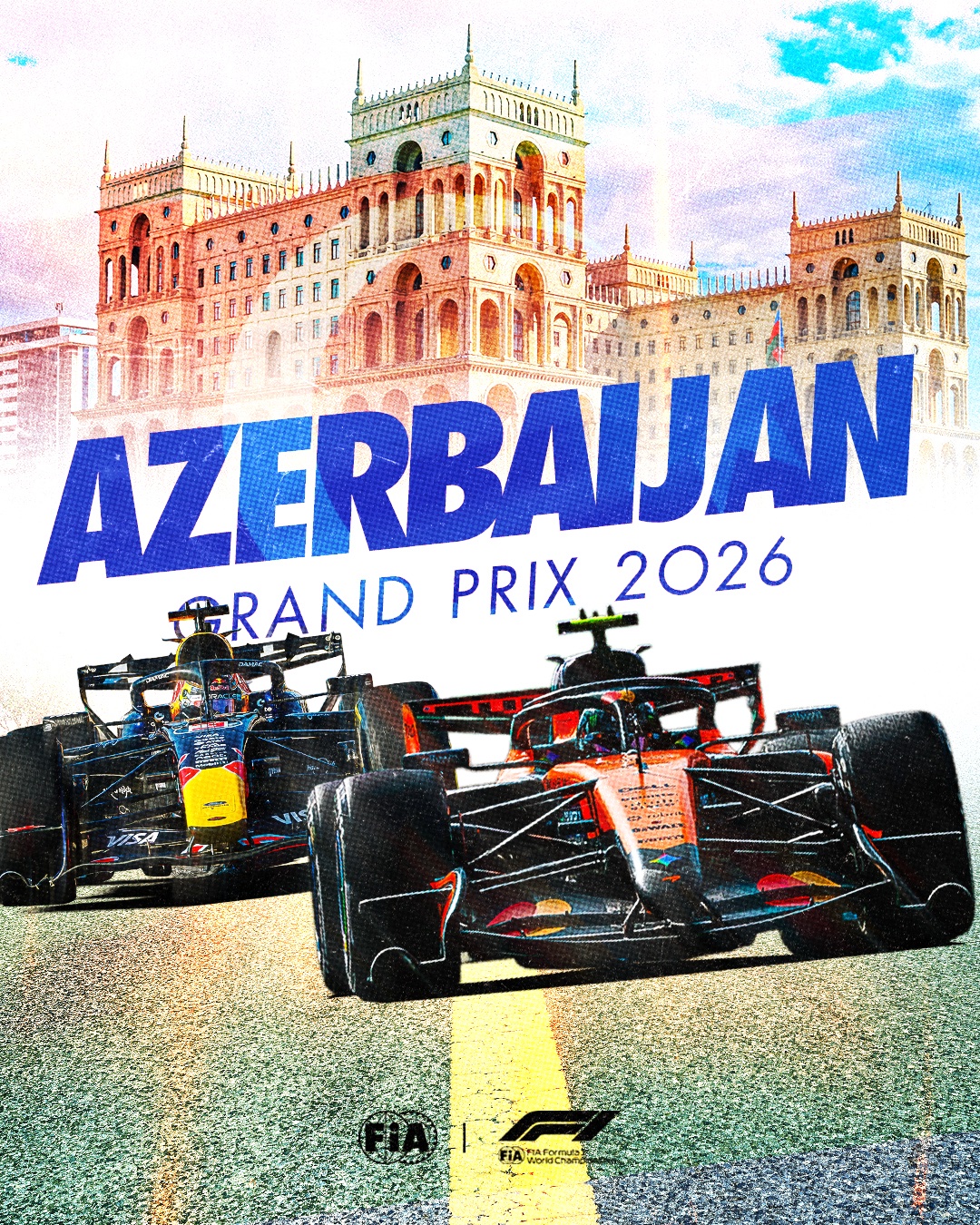
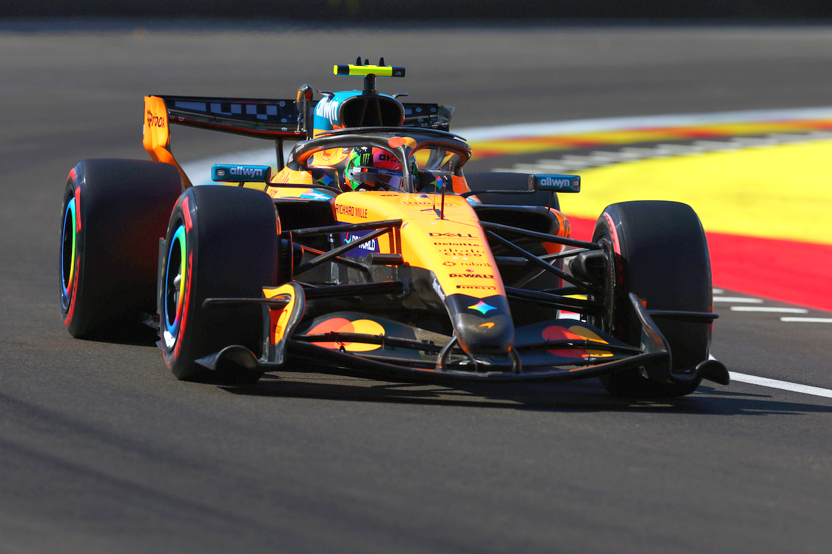
McLaren has unveiled a refreshed logo and evolved brand identity ahead of the Azerbaijan Grand Prix, a move the team says honors its heritage while signaling its future direction.
Why it matters:
The rebrand is more than a cosmetic change. It reflects McLaren's ambition to present a clearer, more unified expression across its racing and automotive operations as it grows its community and expands into new championships.
The Details:
- The new 'McLaren' wordmark is inspired by the sign above Bruce McLaren's family service station in Remuera, Auckland.
- The letter 'c' is now smaller and underlined, paying homage to the founder.
- Papaya remains a core color, but an expanded palette draws on pivotal moments in McLaren's history.
- The instantly-recognisable speedmark retains its prominent position.
David Woodhouse, chief creative officer, said the identity captures McLaren's "restless desire to innovate." Lou McEwen, racing CMO, added that it "perfectly bridges that proud heritage with our future ambition."
The Big Picture:
McLaren is one of F1's most successful teams, with 10 Constructors' and 13 Drivers' titles. The company now competes in F1, IndyCar, and will enter the World Endurance Championship from 2027, making a cohesive brand more important than ever.
What's Next:
McLaren returns to track this week at Baku City Circuit, where the Azerbaijan Grand Prix runs on an alternate weekend format with the race on Saturday.
Original Article :https://www.planetf1.com/news/mclaren-new-logo-2026